


14 Bathroom Colour Schemes + Local Design Gallery
Your bathroom colour scheme sets the mood for the entire space. It’s not just about paint or tile — colour can come through fittings, bathware and accessories. Together, your colour choices affect the light, layout and how everything ties together.
Some renovators want something clean and neutral; others want contrast and colour. It helps to see a few options in action before committing to one direction. Let’s walk through different bathroom colour ideas based on what actually works in real homes.
What are my options for bathroom paint schemes?
There’s no one-size-fits-all approach to bathroom paint. The most common bathroom paint schemes fall into a few categories:
-
Neutral: Think whites, warm greys, stone tones or soft clay. These give you more flexibility when it comes to furniture, tapware and tiles.
-
Contrast: Pairing light with dark — like white and black, or grey with navy — works well when you want structure or a more contemporary look.
-
Earthy: Greens, timbers, stone and sand colours can soften the space and add warmth without making it too busy.
-
Colours: These might use pastels, rich jewel tones or a single standout colour to define the room. They can be fun without feeling over the top.
-
Monochrome: Keeping everything one colour — like all white, all grey or all beige — can feel clean and intentional.
Bathroom colour ideas for your next reno
Soft neutrals

This bathroom balances cool and warm neutrals really well. The soft blueish-grey vanity ties in with the cream-toned wall tiles and floor. Brushed Brass Tapware adds some warmth and detail. It’s a good example of how to mix white with soft colours while keeping things neutral.
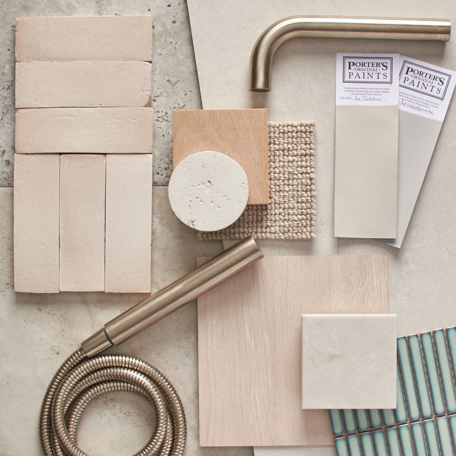
Earthy shades

This space does ‘earthy’ really well. The travertine tiles and terracotta-look tiles perfectly complement each other in both colour and texture. The soft matte basins match the organic feel, and the brass adds a touch of warmth. This is a great combination if you’re after something tonal but not all the same shade.
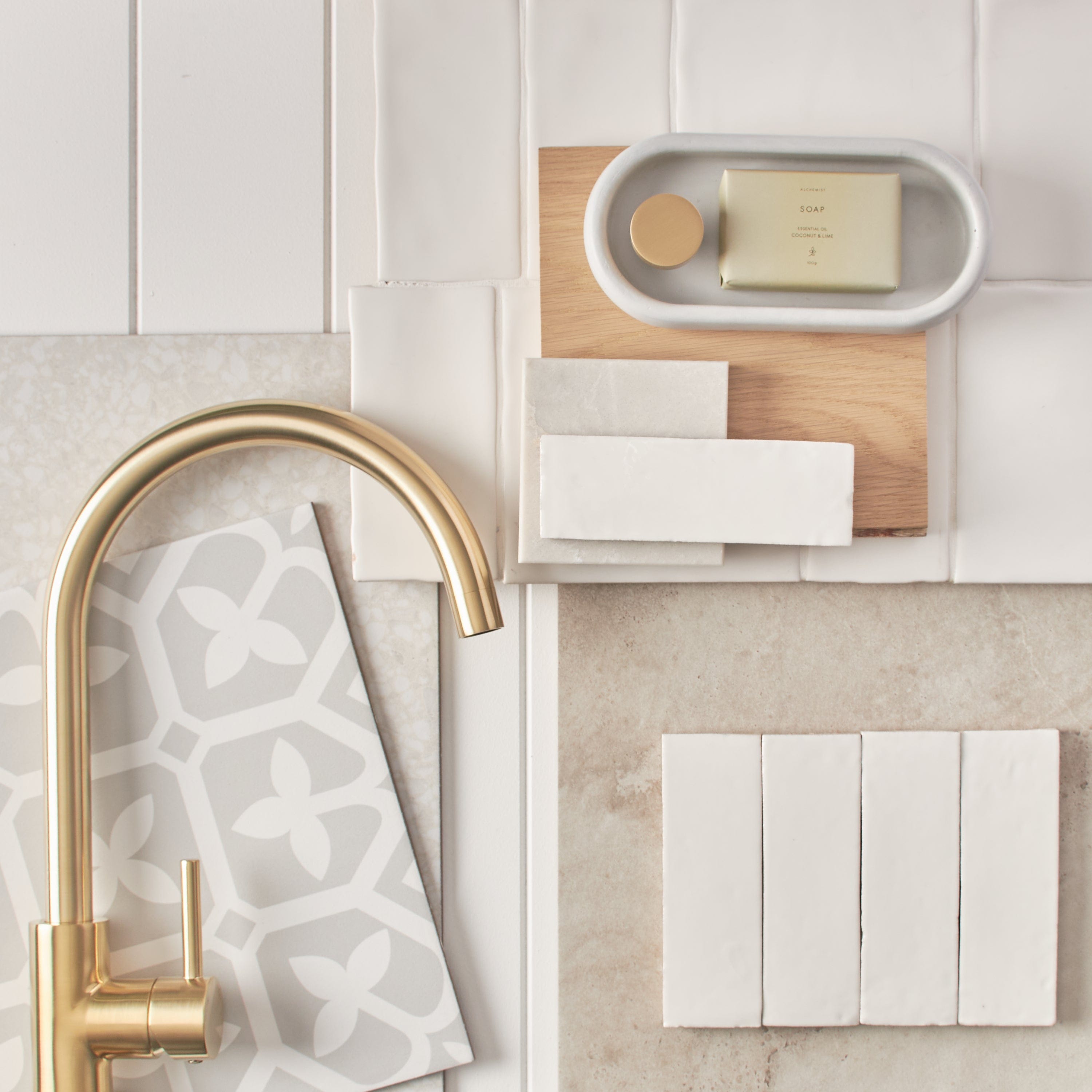
All-white

This bathroom keeps everything in a white-on-white scheme, but it doesn’t feel flat. The different surfaces — panelled walls, patterned floor tiles and matte fixtures — create enough variation to keep it interesting. This is a strong example of how to do monochrome while still making the space feel finished.
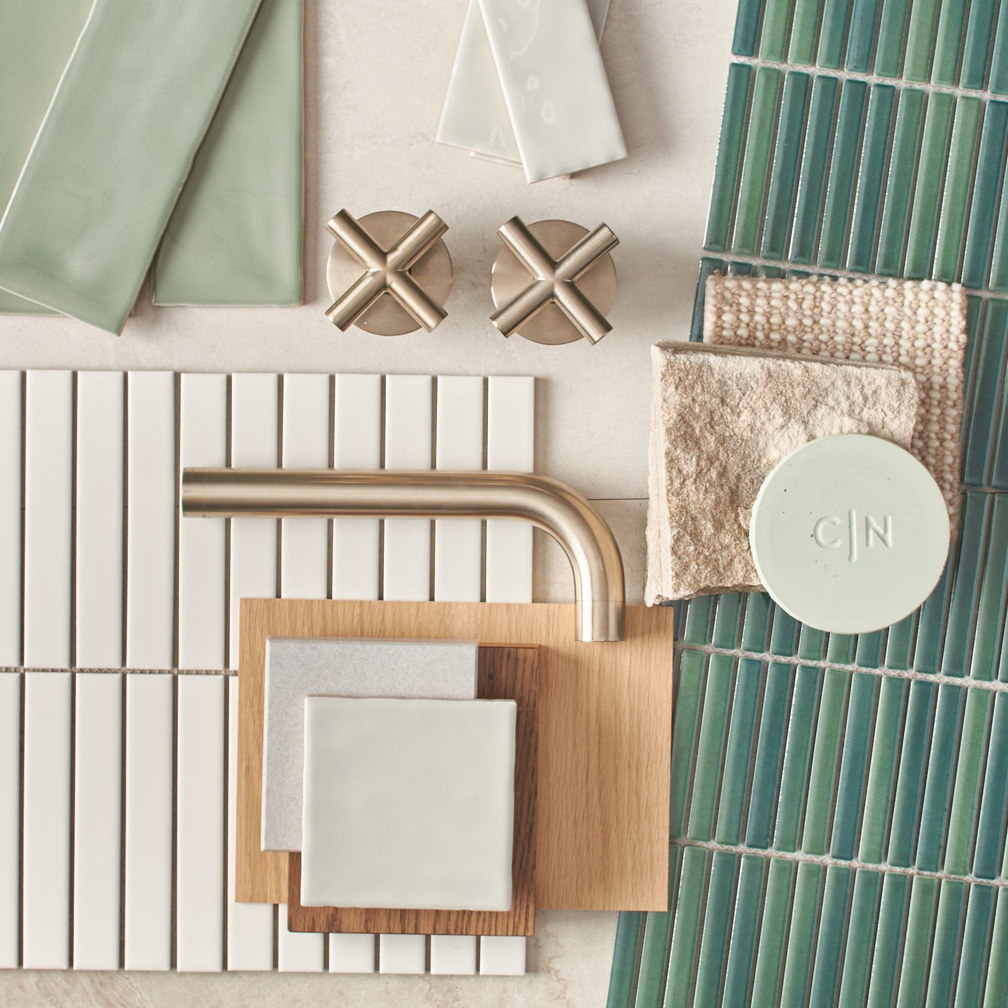
Forest green

This bathroom shows how contrast doesn’t have to mean black and white. The green kit kat tiles with white grout add depth without being heavy. The black basin and accessories give it a modern edge. The timber vanity softens the whole space and adds texture. This is a great bathroom tile colour combination for anyone who likes earthy tones with bold accents.
Black-and-white

This double vanity setup shows how you can keep everything soft while still having a black-and-white theme. The warm grey terrazzo floor and wall tiles add texture without breaking the soft grey scheme. Simple black-framed mirrors tie it all together.
Shades of pink

Time for a statement moment! This bathroom goes bold with pink but keeps it clean. The vertical feathered tiles move through a gradient of tones, making the colour feel layered rather than flat. The vanity and basin are simple — white with soft curves — which lets the wall stand out.
White and blush

The soft pink basin paired with a coral towel and clean white tiled backdrop creates a calm, light-filled space. This is a good example of how neutral bathroom paint colours don’t have to mean just white and grey. Soft clay, almond and muted blush all sit within a similar range but add personality.
Beige and white

Here, the colour scheme is soft and tonal, but the material choice still gives it depth. The beige terrazzo tiles blend nicely into the white tub and zellige tiles. The brushed brass tapware also easily complements the bathroom.
White and sage green

This one’s a good balance between traditional and modern. The soft green shaker vanity feels classic, and the patterned floor tiles add contrast. A simple white tile on the wall keeps the rest of the room from getting too busy. The brass tapware and handles tie it together.
Warm brown

In this bathroom, material choice carries the colour scheme. The terracotta and white checkerboard tile flooring brings in warmth, while the stone benchtop with similar earthy tones keeps things consistent. An Antique Brass Mixer finishes it off. This could be a good scheme for someone looking for something that leans warmer but still feels natural.
Pastels

Blue is always a popular choice in bathrooms, but this one makes it feel fresh. The sky blue diagonal tiles add a fresh kind of movement, while the light grey grout, brass fixtures and timber vanity add enough warmth to balance things out. If you're after something cooler-toned that doesn’t feel cold, this one’s a good fit.
Jade green

This space mixes a few bold elements in a clean way — sage green subways, speckled terrazzo floors and a simple timber vanity. The green tiles and painted door match, which helps the room feel cohesive.
The white countertop and basin keep it fresh, while brass fixtures add a bit of warmth. If you're thinking about colours for bathroom tiles, this is a good example of how muted colour can still make a statement.
Warm white

White doesn’t always have to mean cool or stark. There’s a way to do it that can still feel very comforting. This Port Stephens home has warm white and beige throughout the space. The timber and brass in this bathroom tie in with the rest of the room for a space that feels open and calm.
Deep blue

A strong way to end the list, we have this darker bathroom to show you how to make bold colour feel intentional. The blue kit kat tiles come with a lot of grout lines and texture, and the dark brass tapware pops against them. This is a good direction if you want to explore a deep bathroom paint scheme that doesn’t rely on light colours.
Choosing bathroom colours? Ask the experts
Bathroom colour schemes can change the way your bathroom looks and feels — and how you use it. Whether you want something bold or neutral, tonal or textured, it comes down to how you want the space to work for you. Think about your tiles, vanity, lighting and fittings as part of the same palette. Start with a few colours for bathroom walls or tiles that appeal to you, and build from there.
You don’t need to follow trends. You just need to know what makes sense for your space.
Not sure where to start? Book a free, no-commitment design appointment with our team — we’ll help you figure out what colour schemes work best in your space.

Layla Sawyer
Layla is a creative at heart, with an Advanced Diploma in Interior Design and being the Senior Marketing and Ecommerce Coordinator here at TileCloud she has a passion for staying up to date with the latest trends within the industry. Known for going down a rabbit hole on Pinterest and being a sucker for a good mood board to kick off any project.