Lauren and Tom - Real Life Reno
Lauren & Tom worked on modernising their existing home and building a new extension after the space stopped working for their growing family. With Laurens graphic design background and Tom being a engineer, they knew together with their knowledge they would work on a major renovation of their property in Adelaide. Complete with our Coogee kit kats in the kitchen and the bathroom walls with our Newport matt square and subway pattern and Newport sage subway, this home is a textural haven.
What spaces did you renovate?
We renovated the front four rooms of our old 1910 villa. We demolished a previous extension at the back of the house, and built a new architecturally designed extension. This included adding an ensuite, powder room, butlers pantry and an open kitchen and living area.
What motivated you to renovate?
We bought our house 5 years ago and always had the plan to renovate and extend. We were just waiting for the right time and saving a little more money. I was pregnant with our second child and thought that would be a good time to start the process. The old spaces were not very usable and we needed more living area for our two young boys.
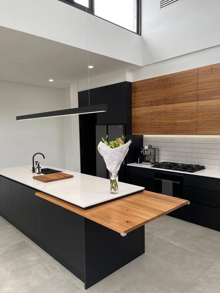
our Coogee kit kats in antique white
Were you living here at the time of your renovations?
No way! Ha! We moved out when I was 36 weeks pregnant with number two as there was no way I was going to live there with two littles under two.
How would you describe your style?
Contemporary, minimalist, textural and tonal. Monochromatic with a touch of colour. Tonal simplicity.
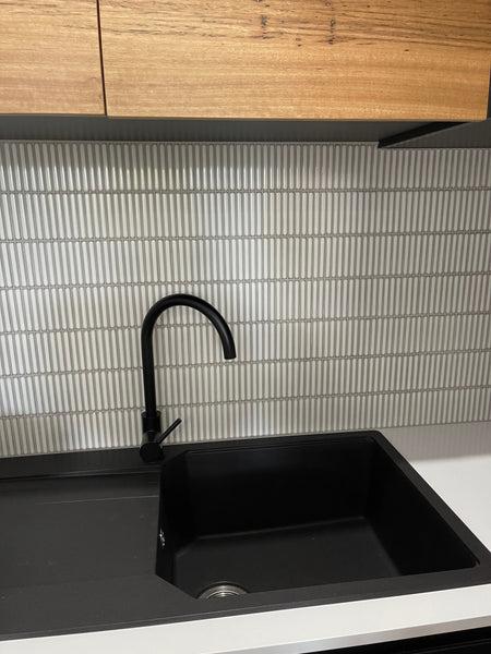
our Coogee kit kats in antique white
Talk us through the process you took in the planning stages of the renovation?
Pinterest was great for sifting through. I created boards for each room/space and then boards for individual details within each room, for example one for the bathroom and then within that I did niches, vanities, mirrors, tiles etc. Tom and I knew what we liked as soon as we saw it and generally agreed on most decisions. Tom also trusts my judgment and design knowledge which was great and I managed to get him across the line on a few tile selections.
Were there any delays? How long did the renovation take?
Yes. We ran over by about 3.5 months. It took 13 months.
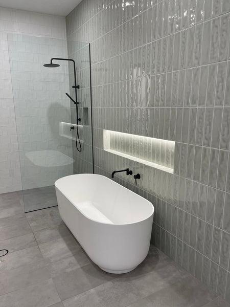
Newport matt square & subway pattern paired with the Newport sage subway on the feature wall
What was the most challenging part of the renovation? Did anything go wrong? How did you adapt?
Integrating the extension with the old part of the house and best utilising the space we had available. Also waiting on supplies and things being out of our control was challenging and sometimes frustrating.
The laundry tiles were a bit of a process to get them right but we got there in the end. Fortunately for us the tiler used the wrong colour grout so it gave us the opportunity to go even darker than we had originally wanted...Initially white grout was used, when we actually wanted to use moon white, a very light grey. We put some grout on some sticky tape to work out if it was white or moon white. The tiler removed the white grout and re-grouted with moon white over the top. There was some damage in the process and the new grout sat too high and almost flush with the tiles. As we weren’t happy with the finish, the tiles were then completely stripped back and re applied from scratch. We then decided to use Manhattan grey grout to give more definition to the individual tiles. We are very happy with the end result. Also waiting for Tom to finish the LED lights around the round mirrors for the ensuite and the bathroom, haha. I just couldn’t wait for them to go up!
Were you juggling a career as well as overlooking the renovations?
I was on maternity leave but Tom was working full time. It was a nice distraction at the start of the global pandemic actually as it gave us something to focus on and going to the site was great getting out of the house.
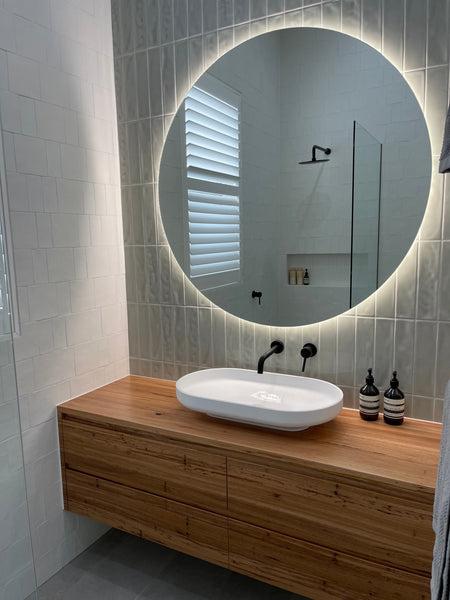
Newport matt square & subway pattern paired with the Newport sage subway on the feature wall
Did you and Tom butt heads over the design at all?
No, luckily Tom and I have very similar taste and liked a lot of the same stuff. We were open to each others ideas and suggestions and managed to compromise on everything really well. He also really trusts my judgement with my design background.
Did you come into the TileCloud showroom to look around at tiles? Did you order samples?
Unfortunately we couldn’t come in but we definitely ordered samples! I think we ordered three lots of the five samples. I’m so glad we did this as we could see the colour, finish, texture and also hold them up on the wall to see how they would look. It also allowed us to check how they would work with the floor tiles, bench tops, cabinetry etc.
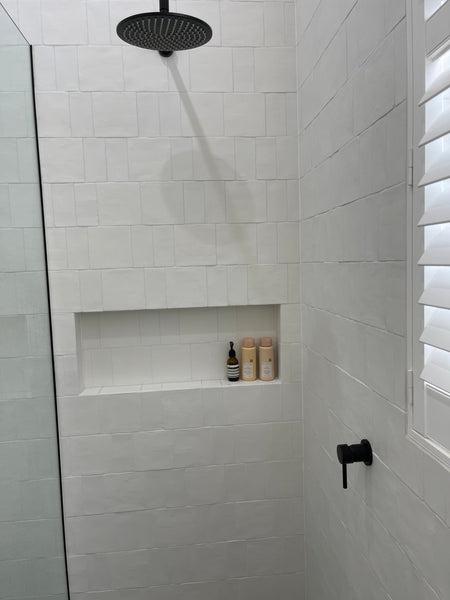
Newport matt square & subway pattern
Why did you choose TileCloud / What did you enjoy best about the TileCloud experience?
Tile cloud has the most beautiful tiles. We loved the range of colours and textures. The website is so easy to navigate and search which really helped. I booked in a phone design appointment with Mel. I had already designed the spaces but it really helped taking it through with one of the consultants. She made a suggestion which I wouldn’t have thought of so I’m glad we did that. We also discussed grout selections which helped us highlight the beauty of the individual tiles.
Any advice for first time renovators?
Try and make selections as early as you can incase anything is out of stock or delayed. Try and avoid using white silicone between the wall and floor tiles as it will get very dirty. I would suggest using the same colour silicone as your floor tiles. Jump on Pinterest to spark inspiration and create some boards. Find things you can DIY to save some money.
Keep up with Lauren and Toms renovation here: @designandabear

As an interior designer at TileCloud, Courtney brings a wealth of knowledge and expertise to the world of home renovation. With a Diploma in Interior Design and Decoration and a passion for creating stunning interiors, shes dedicated to helping people on their journey to transform their homes. Currently channeling her expertise into renovating her own home, she aims to share valuable insights, tips, and inspiration to assist others in achieving their dream space!
