
Making Bold Colours and Patterns Work in Your Home (Without the Overwhelm)
Like many of us, you have probably come across striking Pinterest images of bold, colourful, and daring home designs. While they look incredible online, you may struggle to envision bringing the same intensity to your own home. Don’t worry, we have cracked the code and are here to help you achieve the current bold colour interior design trend in your home in an authentic way, without opting for design choices you will later regret.
Bold patterns and colours are definitely having their moment in the spotlight, and for good reason; bringing a bit of colour into everyday spaces can enhance the mood of the space. There's also something incredibly satisfying about walking into a space that feels vibrant, confident, and “you”. It's not about throwing every bright colour and busy pattern together and hoping for the best. The secret to nailing bold interior design in your home lies in understanding balance. When done right, statement tiles and eye-catching patterns can create spaces that feel energizing without being overwhelming.
The key is knowing how to use bold colours in decor strategically, by having big focal points that draw the eye while keeping things simple throughout the rest of the space. Whether you're planning bright, bold bathrooms that bring some energy to your morning routine or adding feature walls in your living room to bring some joy to the space, the principles remain. It's about creating intentional moments of impact while giving your eyes places to rest.
Interior design bold colours work best when they're supported by thoughtful planning and careful balance. So, stick with us and let's discover how to use bold colours in decor without causing chaos.
Start with a Neutral Base
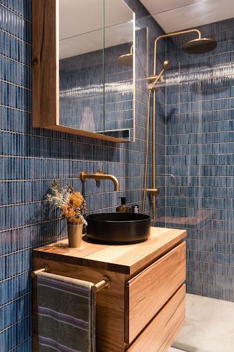
Bold colour interior design works best when you create a neutral foundation that lets your statement pieces truly shine. Think crisp whites, warm greys, or soft beiges for walls, larger furniture pieces, and any permanent fixtures. This approach prevents your space from feeling chaotic while ensuring your bold choices become the hero piece of the room rather than competing for attention. A neutral base also makes it easier to change accessories and smaller elements over time without completely overhauling your design.
Understanding colour psychology helps you choose neutrals that enhance rather than diminish your bold choices, as well as picking bold colours that work for the mood you want to create.
Choose Your Focal Point Wisely
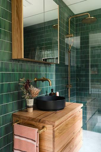
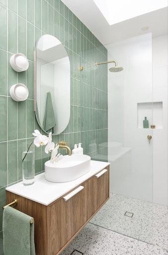
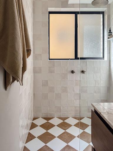
Bold interior design succeeds when you resist the urge to make everything a statement. Instead, choose one key area (ahem, may we perhaps suggest incorporating feature tiles), consider a colourful splashback, a bold shower wall, or an eye-catching accent wall. Here’s some bathroom feature wall tile inspo for those looking for some visual inspiration.
Having a focal point creates a natural hierarchy in your space and prevents visual overwhelm. Your focal point should be the first thing people notice when they enter the room, drawing the eye and setting the tone for the entire space. Keep the surrounding areas simpler.
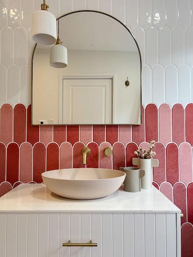
Limit Your Colour Palette
Choose two to three key colours from your statement tiles or feature focal points and carry them through your space via accessories like towels, artwork, or decor pieces. This creates cohesion and makes even the boldest choices feel intentional rather than random. For inspiration on how this works in practice, check out these bright, bold bathrooms that use colour coordination beautifully. The key is ensuring every bold choice feels connected to the overall vibe rather than standing alone.
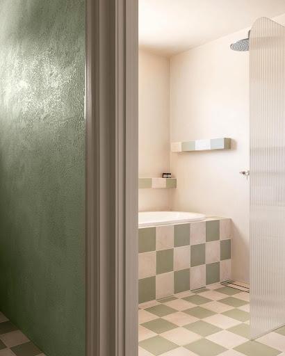
Mix Patterns Mindfully
Bold interior design often includes patterns, but mixing them requires a careful approach (though, when done correctly, it is an amazing feat). Stick to a cohesive colour scheme when combining different patterns, and vary the scale to create visual interest without chaos. For example, pair a large geometric tile with smaller, more intricate patterns in accessories. The secret is ensuring patterns share at least one common colour and vary in scale and intensity. Our guide on how to mix and match tiles offers more detailed strategies for creating harmony between different patterns and textures without overwhelming your space.
Consider Scale and Proportion
Let’s talk tiles. Tile shape and size should relate directly to your room's scale. Large format tiles can make small spaces feel bigger, while smaller mosaic tiles add intricate detail that works beautifully in powder rooms or as accent features. Bold patterns in oversized tiles can overwhelm tiny spaces, while small patterns might get lost in large rooms. Consider how your chosen tiles will interact with the room's proportions. If you need any advice, don’t be afraid to reach out to our experienced designers.
The beauty of working with statement tiles and eye-catching patterns is that they can completely change how a space feels without requiring a complete overhaul.
Remember, the most successful bold interior design happens when you trust your instincts while following a few key principles. Start with that neutral foundation, choose your moment to shine, and let your chosen colours weave through your space in thoughtful ways.
The most important thing? Start somewhere. Even the smallest splash of bold colour can bring joy to your space.

Layla is a creative at heart, with an Advanced Diploma in Interior Design and being the Senior Marketing and Ecommerce Coordinator here at TileCloud she has a passion for staying up to date with the latest trends within the industry. Known for going down a rabbit hole on Pinterest and being a sucker for a good mood board to kick off any project.