
Colour Psychology: How Colour Can Transform Your Home and Mood
Colour can influence our mood in surprising ways. That relaxed feeling you get in your bedroom or the upbeat vibe in your kitchen aren’t accidents — they’re responses to the colours around you. With this in mind, decisions like paint or tile colours carry a little more weight.
Understanding colour psychology helps you make design choices that create the exact feeling you want in each space. If you’re in the middle of a home build or reno and can’t decide on a colour, this is a great place to start.
Colour psychology 101
Colour does more than meets the eye. It shapes our mood, influences our mindset and even impacts how we experience a space. Whether we realise it or not, the colours in our homes are constantly working behind the scenes, energising us, soothing us or setting the tone for how we live and feel each day.
Clinical and Forensic Psychologist Ann Monis explains this in the context of psychology: “One of the many ways colour affects emotions is through its influence on the nervous system. Certain colours can trigger physiological responses that either calm or stimulate the brain.”
While most of us have similar reactions to the same colour, our personality also shapes our preferences.
“Those who are drawn to peaceful, structured environments tend to like soft, muted colours,” Monis says. “Those who live for a more adventurous lifestyle dress themselves in bright, high-contrast colours that reflect their dynamic energy.”
Understanding these connections between colour, emotion and personality helps us make better home design choices.
The psychology of colour in interior design
When you choose colours for your home, you're actually designing how you want to feel every day.
RedAwning Lead Designer Elissa Hall uses this approach in her work: “I always start at the beginning with the moods and intentions of the space in mind, so the colours create a sensation.”
With this approach, you’re matching colours to how you live and feel rather than just following trends.
She continues: “Bedrooms tend to favour cooler shades like soft blues or light greens to promote calm and better sleep, while the kitchen may embrace warmer shades or even a pop of bright yellow in order to promote conversation and creativity.”
We’ll take a closer look at how colours make you feel and where they work best in your home.
Tile colours: What they say and how to use them
Once you understand how colours impact mood and energy, it makes sense to think carefully about where and how you use them — especially in permanent features like tiles.
Whether it's your bathroom, kitchen or entryway, tile colour plays a big role in shaping how the space feels. Let's see how different tile colours influence mood and where they work best in the home.
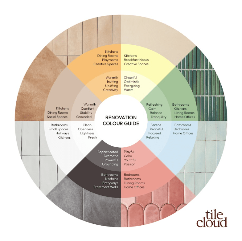
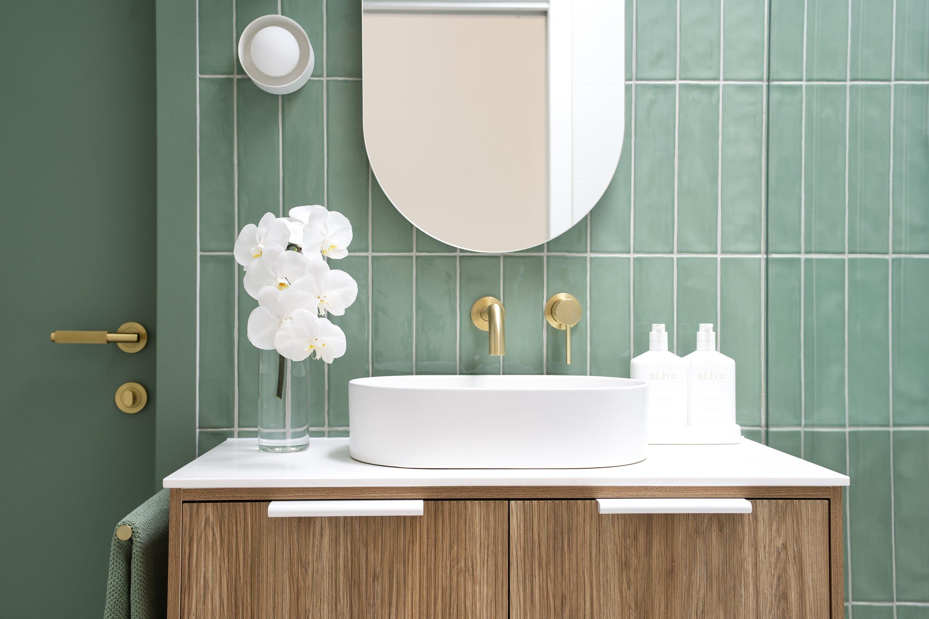
Green
- Emotions: Refreshing, calm, balance, tranquillity
- Where it’s best: Bathrooms, kitchens, living rooms, home offices
- Our favourites: Newport Gloss Subway Jade Green Tile, Coogee Antique Forest Green Kit Kat Mosaic Tile, Broadwater Green Gloss Penny Round Mosaic Tile
Green tiles bring nature inside and help reduce stress. Our brains associate green with the outdoors, creating a fresh, clean feeling that can make you feel more relaxed and balanced. People who choose green might appreciate environments that help them unwind and think clearly.
Progress Wellness Psychotherapist Angela Ficken explains: “Green mimics the restorative qualities of nature, reducing eye strain and promoting mental clarity — perfect for workspaces or study areas.”
Blue
- Emotions: Serene, peaceful, focused, relaxing
- Where it's best: Bathrooms, bedrooms, home offices
- Our favourites:Newport Gloss Mini Subway Duck Egg Blue Tile, Coogee Antique Blue Kit Kat Mosaic Tile, Newport Gloss Mini Subway Ocean Blue Tile
Blue has a way of making us feel calmer. According to Ficken, this is a physiological response: “Blues have been proven to lower heart rate, decrease stress hormones and promote relaxation. [It’s] associated with feelings of security and stability.”
This makes blue tiles a natural choice for busy people who want the home to be somewhere to unwind.
Pink
- Emotions: Playful, calm, youthful, passionate
- Where it's best: Bedrooms, bathrooms, dining rooms, home offices
- Our favourites:Fitzroy Gloss Mixed Pink Feather Tile, Newport Gloss Mini Subway Baby Pink Tile, Newport Gloss Subway Baby Pink Tile
Pink tiles create spaces that feel fresh and lively. It works in both small and large areas, with lighter pinks opening up small spaces and deeper pinks adding character to larger rooms.
People who like pink tiles might have a creative streak that they want to bring home. It’s also one of those colours that changes a lot depending on the shade — blush pink might calm you, while a deep rose may feel more romantic.
Black
- Emotions: Sophisticated, dramatic, powerful, grounding
- Where it's best: Bathrooms, kitchens, entryways, statement walls
- Our favourites:Avoca Black Encaustic Look Tile, Broadwater Black Gloss Penny Round Mosaic Tile, Brighton Beach Black Encaustic Look Hexagon Tile
Confident and decisive people are drawn to black. It’s a powerful colour that can transform a room depending on how you use it.
While some use black tiles to create dramatic, high-contrast environments, Tinzeltown Interior Designer and Owner Daniela Gottschalk makes a case for the other side of the coin.
“Rooms in which you want to relax ideally come in a moody colour,” she says. “Darker hues can also calm you down and create a cosy, cocooning atmosphere.”
White
- Emotions: Clean, open, light, fresh
- Where it's best: Bathrooms, small spaces, kitchens, hallways
- Our favourites: Newport Matte Subway White Tile, Thirroul White Matte Subway Tile, Stirling White Terrazzo Look Tile
White tiles brighten spaces by reflecting light, making rooms feel bigger and more open. They can also have a calming effect, according to Ficken.
“Neutrals like muted whites create a distraction-free zone, allowing the mind to concentrate better,” she says.
The hardest thing with white is maintenance — it shows dirt more easily than darker colours. This means people who choose white tiles don't mind putting extra effort into their homes.
Brown
- Emotions: Warm, comfortable, stable, grounded
- Where it's best: Kitchens, dining rooms, social spaces
- Our favourites:Boat Harbour Beach Terracotta Encaustic Look Hexagon Tile, Haddon Terracotta Matte Medium Square Tile, Randwick Matte Sand Recycled Tile
Brown and beige tiles make spaces feel warm and cosy. People who choose these colours might want to bring the calming feel of nature indoors.
Hall elaborates: “Mud colours [like brown], gentle pastels and delicate greens among the trending colours which in sum create tranquillity, seniority and nature connection.”
Orange
- Emotions: Warm, inviting, uplifting, creative
- Where it's best: Kitchens, dining rooms, playrooms, creative spaces
- Our favourites:Northbridge Peach Terracotta Look Subway Tile, Thirroul Terracotta Look Matte Subway Tile, Bronte Checkerboard Terracotta & White Tile
Most orange tiles in homes lean more terracotta than intensely orange. It’s the warmth, not the brightness, that makes spaces feel lived-in. People who choose orange often want their home to have this welcoming vibe.
Ficken speaks to the colour’s impact and where it works best: “Orange can be invigorating and social, working well in dining rooms or creative studios.”
Yellow
- Emotions: Cheerful, optimistic, energising, warm
- Where it's best: Kitchens, breakfast nooks, creative spaces
- Our favourites:Bronte Checkerboard Butter & White Tile, Randwick Matte Sand Recycled Tile, Newport Matte Clay Small Square Tile
Yellow tiles create spaces filled with bright energy. This colour actually creates a psychological response in us, according to Ann Monis:
“Yellow has a way of lifting the mood almost instantly. It assists our body in producing serotonin, which puts us in a good mood and clears our minds.”
How to make the right colour call
Now that you know how different colours affect mood and which rooms they work best in, how do you narrow down your options? Here's a simple approach when choosing the right colour tile.
See your options in person
When you paint, it’s normal to pick up a few samples and pop them on the wall to figure out what you like. The same should go for tiles. Start with a few colours that feel right and order a sample pack — having physical tiles in your hands lets you see the true colours and textures that might not come through in photos. Then, place them where they’ll be installed to see how they feel in context.
Tie it in with the rest of the room
You don’t tile a room and call it a day. There’s so much else that will go in the room, so you need to think about how your countertop, decor and paint will go with your tiles.
Look for tiles that complement or intentionally contrast with these other elements. You want to create a cohesive colour story rather than having things feel disconnected.
Think about lighting
Light dramatically changes how colours come off. Morning sun brings out different tones than evening light, and artificial lighting adds another dimension entirely.
Hall cautions: “A common pitfall is ignoring the effects of natural light and the established textures in the room, resulting in colours that feel out of place.”
Test your samples at different times of day where they'll be installed.
Need help picking colours?
You don’t have to make the decision by yourself. Start with our style quiz to help you narrow down your options.
If you’re still confused, reach out to us. We help people choose the perfect tiles for their builds and renovations every day. In a free design appointment, we can talk through your colour options and whether they would work with your space and vision. We’ll show you what your top picks look like next to different wall, tapware, bathware and furniture colours.

Layla is a creative at heart, with an Advanced Diploma in Interior Design and being the Senior Marketing and Ecommerce Coordinator here at TileCloud she has a passion for staying up to date with the latest trends within the industry. Known for going down a rabbit hole on Pinterest and being a sucker for a good mood board to kick off any project.